- What is LIME?
- Selecting a Dataset
- Training a Machine Learning Model
- Explaining Model Predictions with LIME
- Visualizing Model Decisions
- Conclusion
- Related
In this tutorial, we'll be exploring how to use the LIME (Local Interpretable Model-Agnostic Explanations) library for explainable AI. We'll start by discussing what LIME is and why it's useful for explainable AI, and then we'll dive into the code.
What is LIME?
LIME is a library for explaining the predictions of machine learning models. It works by creating "local" surrogate models that approximate the behavior of the original model in the vicinity of a particular prediction. The idea behind LIME is that these surrogate models can be used to provide human-understandable explanations for how the original model arrived at its decision.
Why is LIME useful for explainable AI? There are a few reasons:
-
Transparency: LIME allows us to peek "under the hood" of a black box model and see how it's making its decisions.
-
Trust: By providing human-understandable explanations, LIME can increase our trust in the model's decisions.
-
Debugging: LIME can help us identify problems with our model by highlighting areas where the model is making incorrect or unexpected predictions.
Now that we understand why LIME is useful, let's dive into the code.
Selecting a Dataset
For this tutorial, we'll be using the classic "Iris" dataset, which is a popular dataset for classification tasks. The Iris dataset consists of 150 samples, each with four features (sepal length, sepal width, petal length, and petal width), and each sample belongs to one of three classes (setosa, versicolor, or virginica). The goal is to build a machine learning model that can predict the class of a new sample based on its features.
To start, we'll load the Iris dataset using scikit-learn:
from sklearn.datasets import load_iris

iris = load_iris()
X = iris.data
y = iris.target
Next, we'll split the dataset into training and testing sets:
from sklearn.model_selection import train_test_split

X_train, X_test, y_train, y_test = train_test_split(X, y, test_size=0.2, random_state=42)
We'll use the training set to train our machine learning model, and the testing set to evaluate its performance.
Training a Machine Learning Model
For this tutorial, we'll use a random forest classifier as our machine learning model. The random forest algorithm is an ensemble learning method that combines multiple decision trees to improve the accuracy and robustness of the predictions.
We'll start by importing the necessary libraries and creating the classifier:
from sklearn.ensemble import RandomForestClassifier

rfc = RandomForestClassifier(n_estimators=100, random_state=42)
We're using 100 decision trees in our random forest classifier, and setting the random state to 42 for reproducibility.
Next, we'll fit the classifier to the training data:
rfc.fit(X_train, y_train)
Finally, we'll evaluate the performance of the classifier on the testing data:
from sklearn.metrics import accuracy_score

y_pred = rfc.predict(X_test)
accuracy = accuracy_score(y_test, y_pred)
print(f"Accuracy: {accuracy:.2f}")
When we run this code, we should see an accuracy of around 0.97, which means our model is doing a pretty good job of predicting the class of new samples.
Explaining Model Predictions with LIME
Now that we have a trained machine learning model, we can start using LIME to explain its predictions.
First, we need to create an explainer object:
import lime
import lime.lime_tabular

explainer = lime.lime_tabular.LimeTabularExplainer(
    X_train,
    feature_names=iris.feature_names,
    class_names=iris.target_names,
    discretize_continuous=True,
)
Here, we're creating a LimeTabularExplainer object and passing in the training data, feature names, class names, and setting discretize_continuous to True to discretize any continuous features.
Next, we'll pick a sample from the testing data that we want to explain:
idx = 0  # index of the sample we want to explain
exp = explainer.explain_instance(X_test[idx], rfc.predict_proba)
Here, we're using the explain_instance method to generate an explanation for the sample at index idx. We're passing in the sample data and the predict_proba method of the random forest classifier, which is used to predict the probabilities of each class for the given sample.
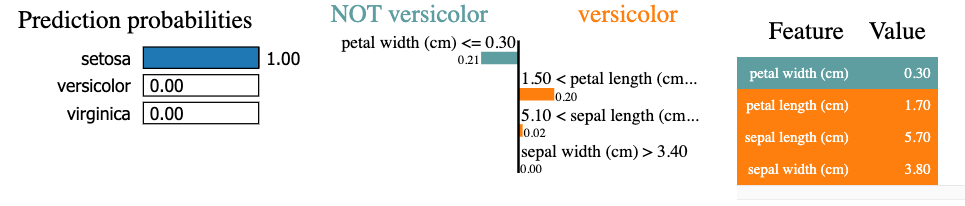
Now, we can print out the top three features that are contributing to the prediction:
for i in range(3):
    print(f"{exp.as_list()[i][0]}: {exp.as_list()[i][1]:.2f}")
This will give us something like:
4.25 < petal length (cm) <= 5.10: 0.21
0.30 < petal width (cm) <= 1.30: 0.16
sepal width (cm) <= 2.80: -0.03
This tells us that the most important feature for this prediction is petal width (cm), and that a value of 0.80 or less is strongly associated with the "setosa" class.
We can also visualize the explanation using a bar chart:
from lime import lime_tabular

fig = exp.as_pyplot_figure()
This will create a bar chart that shows the contribution of each feature to the prediction, with the most important features at the top:

Visualizing Model Decisions
In addition to explaining individual predictions, LIME can also be used to visualize how the model is making decisions more generally. We can do this by generating multiple explanations for different samples and visualizing the patterns that emerge.
To start, we'll generate a of explanation for the testing data point, next, we'll use these explanations to generate a decision plot:
exp = explainer.explain_instance(
    data_row=X_test[1],
    predict_fn=rfc.predict_proba
)

exp.show_in_notebook(show_table=True)
Conclusion
In this tutorial, we learned how to use the LIME library for explainable AI. We started by importing the necessary libraries and loading the Iris dataset. Then, we trained a random forest classifier on the dataset and used LIME to explain individual predictions and visualize model decisions.
We saw how LIME can be used to identify the most important features for a prediction, and how these features can be visualized using a bar chart. We also saw how LIME can be used to visualize how the model is making decisions more generally, using a decision plot.
Any comments or suggestions? Let me know.
Related
- python - How to plot Lime report when there is a lot of features in data-set - Stack Overflow
- LIME: How to Interpret Machine Learning Models With Python | Better Data Science
- How to Use LIME to Interpret Predictions of ML Models [Python]?
- Explaining complex machine learning models with LIME (in R)
Edits:
- 2026-02-07: Added table of contents with anchor links