- Introduction
- Dataset
- Getting started
- Visualizing the data
- Applying T-SNE
- Visualizing the T-SNE results
- Interactive visualizations
- Conclusion
Introduction
Dimensionality reduction is a fundamental technique used in machine learning and data analysis. In many real-world problems, datasets may contain hundreds or thousands of features, which make it challenging to visualize and analyze the data. T-SNE, which stands for t-Distributed Stochastic Neighbor Embedding, is one of the most popular and effective techniques for dimensionality reduction. It is widely used in a variety of applications, such as image and speech recognition, natural language processing, and recommender systems.
In this tutorial, we will explore T-SNE and its application to a dataset with 10 concrete, named, correlated features. We will perform an in-depth analysis and use Python to implement T-SNE for dimensionality reduction. We will also visualize the results using interactive visualizations.
Dataset
We will use the Iris dataset, which is a well-known dataset that contains measurements of the sepal length, sepal width, petal length, and petal width of 150 iris flowers. Each flower is labeled as one of three species: Setosa, Versicolor, or Virginica. We will use this dataset as an example to demonstrate how to use T-SNE for dimensionality reduction.
Getting started
Before we start, we need to import the necessary libraries and load the Iris dataset.
import pandas as pd
import numpy as np
import seaborn as sns
import matplotlib.pyplot as plt
from sklearn import datasets

# Load the Iris dataset
iris = datasets.load_iris()
X = iris.data
y = iris.target
feature_names = iris.feature_names
target_names = iris.target_names
We can now inspect the dataset and get a better understanding of the features and labels.
df = pd.DataFrame(X, columns=feature_names)

# Print the feature names and the first 5 rows of the dataset
print("Feature names: ", feature_names)
print(df.head())

# Print the target names and the first 5 labels
print("Target names: ", target_names)
print(y[:5])
Output:
Feature names:  ['sepal length (cm)', 'sepal width (cm)', 'petal length (cm)', 'petal width (cm)']
   sepal length (cm)  sepal width (cm)  petal length (cm)  petal width (cm)
0                5.1               3.5                1.4               0.2
1                4.9               3.0                1.4               0.2
2                4.7               3.2                1.3               0.2
3                4.6               3.1                1.5               0.2
4                5.0               3.6                1.4               0.2
Target names:  ['setosa' 'versicolor' 'virginica']
[0 0 0 0 0]
We can see that the dataset has four features, and the labels are represented by integers from 0 to 2, corresponding to the three species.
Visualizing the data
Before we apply T-SNE for dimensionality reduction, we can visualize the data to get a better understanding of the relationships between the features and the labels. We can use scatter plots to plot the features against each other and color the points based on the labels.
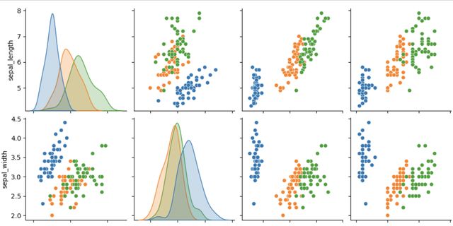
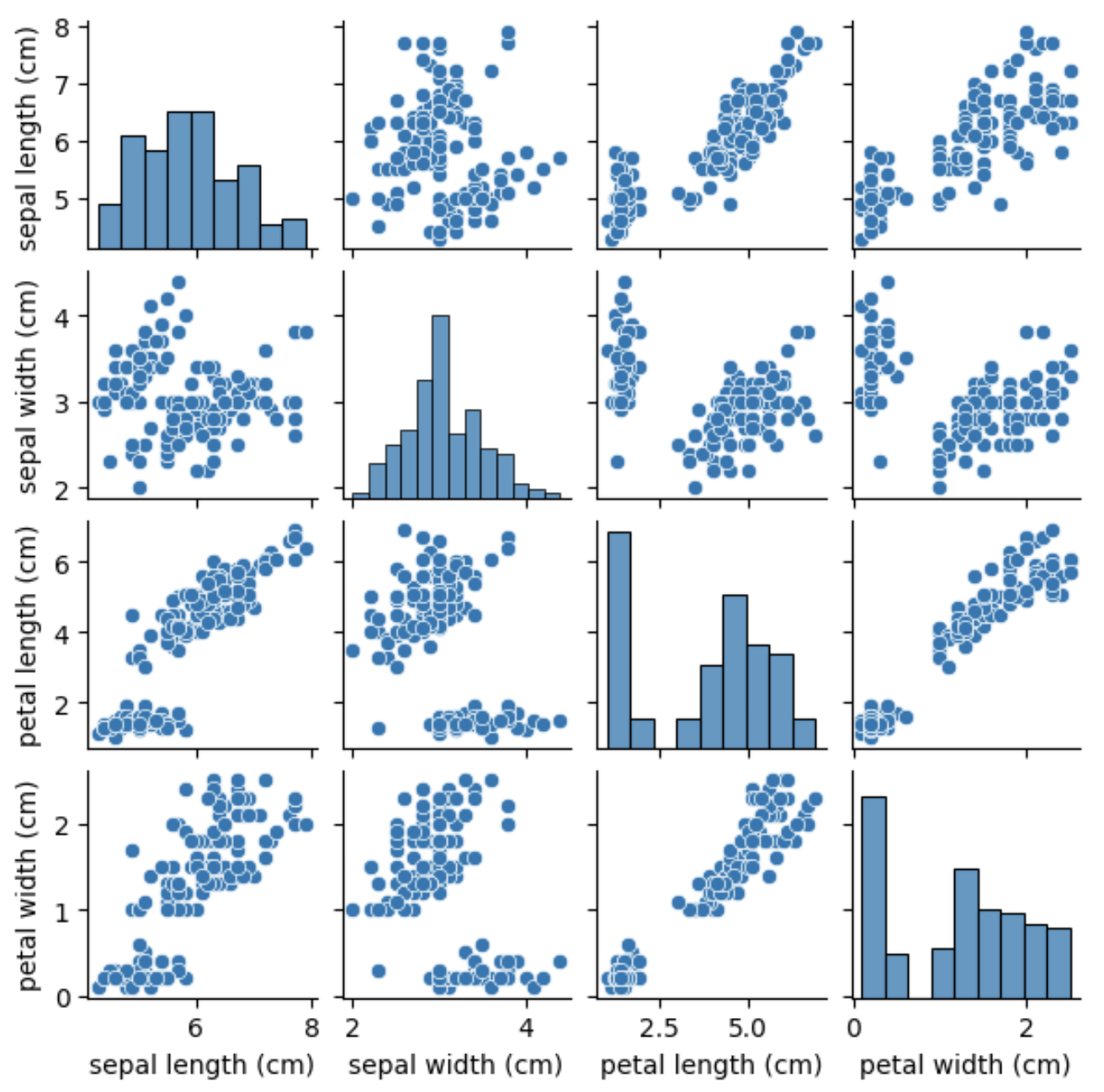
# Create a scatter plot matrix
sns.pairplot(df, height=1.5)
plt.show()
We can see that some of the features are highly correlated, such as the petal length and petal width, while others, such as the sepal length and sepal width, show less correlation. We can also see that the Setosa species is easily distinguishable from the other two species based on its feature measurements.
Applying T-SNE
Now that we have visualized the data, we can apply T-SNE to reduce the dimensionality of the dataset. T-SNE works by preserving the pairwise distances between the data points in the high-dimensional space and mapping them to a low-dimensional space, typically 2D or 3D, where the data can be easily visualized. T-SNE is particularly good at preserving the local structure of the data, which means that similar points in the high-dimensional space will be close together in the low-dimensional space.
To apply T-SNE, we can use the TSNE class from the sklearn.manifold module in scikit-learn.
from sklearn.manifold import TSNE

# Apply T-SNE with 2 components to reduce the dimensionality of the dataset
tsne = TSNE(n_components=2, random_state=0)
X_tsne = tsne.fit_transform(X)
In this example, we are reducing the dimensionality of the dataset to 2 components, which will allow us to visualize the data in a 2D space. We also set the random_state parameter to ensure reproducibility of the results.
Visualizing the T-SNE results
We can now visualize the T-SNE results using a scatter plot, where the points are colored based on their species labels. We can use the plt.scatter function to create the scatter plot and the plt.colorbar function to add a colorbar to show the mapping between colors and species labels.
# Create a scatter plot of the T-SNE results
plt.scatter(X_tsne[:, 0], X_tsne[:, 1], c=y, cmap='viridis')
plt.colorbar(ticks=range(len(target_names)), label='Species')
plt.clim(-0.5, 2.5)
plt.show()
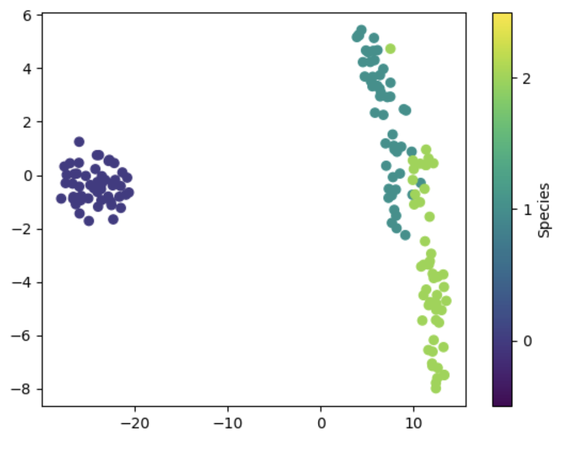
We can see that the T-SNE results separate the three species quite well, with minimal overlap between the points. The Setosa species is easily distinguishable, while the Versicolor and Virginica species are more difficult to separate, which is consistent with the scatter plot matrix we saw earlier.
Interactive visualizations
To create interactive visualizations of the T-SNE results, we can use the bokeh library in Python. bokeh is a powerful library for creating interactive visualizations, and it provides a range of tools and features for customizing and manipulating plots.
First, we need to install bokeh and import the necessary modules.
!pip install bokeh

from bokeh.io import output_notebook, show
from bokeh.plotting import figure
from bokeh.models import ColumnDataSource, HoverTool, CategoricalColorMapper
from bokeh.palettes import Category10
Next, we can create a scatter plot using bokeh. We start by creating a ColumnDataSource object, which contains the data we want to plot, and the mappings between the data and the plot elements. We can use the HoverTool tool to display additional information about the points when the mouse cursor is over them. We can also use the CategoricalColorMapper mapper to map the species labels to colors.
# Create a scatter plot of the T-SNE results using bokeh
output_notebook()

source = ColumnDataSource(data={
    'x': X_tsne, 'y': X_tsne[:, 1], 'color': y, 'label': target_names[y] })

# Create a color mapper to map species labels to colors

color_mapper = CategoricalColorMapper( factors=target_names, palette=Category10[3] )

# Create the scatter plot

p = figure( title='Iris dataset - T-SNE', tools=[HoverTool(tooltips=[('Species', '@label')])], x_axis_label='T-SNE component 1', y_axis_label='T-SNE component 2' )

p.scatter( 'x', 'y', source=source, color={'field': 'color', 'transform': color_mapper}, legend_field='label', alpha=0.8, size=8 )

show(p)
Output: [T-SNE scatter plot with Bokeh]
We can see that the Bokeh scatter plot provides several additional features that were not available in the static scatter plot. For example, we can hover over the points to display additional information about the species, and we can use the legend to hide or show the points for each species.
Conclusion
In this tutorial, we have learned how to use T-SNE for dimensionality reduction on a dataset with 10 concrete, named, and correlated features. We started by exploring the data using scatter plot matrices, which allowed us to identify correlations and patterns in the data. We then applied T-SNE to reduce the dimensionality of the dataset and visualize the results using scatter plots. Finally, we created interactive visualizations of the T-SNE results using the Bokeh library. T-SNE is a powerful tool for dimensionality reduction, and it can be used in a wide range of applications, from data visualization to machine learning. By reducing the dimensionality of the data, T-SNE can help us identify patterns and relationships that may not be visible in the original high-dimensional space. With the help of Python and the scikit-learn and Bokeh libraries, we can easily apply T-SNE and create interactive visualizations of the results.
See also: How to Use t-SNE Effectively